Monday 31 December 2012

Nelson Section map in production [2]

I have pasted about half the maps so far into the document so progress is being made. Unfortunately when I saved this as a PDF, a further conversion stage has resulted in unacceptable additional style changes that are departing too far from where the map was originally. It is starting to look like, if I want to produce a PDF format map, I will have to look at ways it can be output using the PDF export capability directly from Qgis. Otherwise there is too much lost in the conversions of various stages of the map into a document format.

I have done a bit more experimentation and have exported a map as a PDF. It was then opened in Word, and then published back to PDF format. The result was that the styles were still being preserved much closer to the original styles, even allowing for the conversions that have occurred. Creating a multi page version in Word copying and pasting the original graphic still produced the much higher style. The problem seems to be in the conversion of, firstly, Qgis to SVG, which is known to have significant issues, and secondly, SVG to EMF from Inkscape to Word. Then a further problem occurs with the conversion of EMF in Word to PDF, which is probably now EPS format. Word seems to be handling the conversion from EPS to EMF and back to EPS a lot better, and therefore we have to assume that Inkscape isn’t doing its part of the conversion very well, apart from the Qgis to SVG problem.

At this stage I thought I would take a look at how Inkscape handles PDF files, which it can also open. The file looked exactly right in Inkscape when opened, but again lost detail in the clipboard conversion to EMF for Word, where it looks like the other EMFs. When I saved from Inkscape to an EPS and then tried to paste it in Word, it could not be displayed in Word. The save to EMF file format revealed where the main problem is occurring – Inkscape’s extremely limited EMF conversion support is obviously the problem.

It appears I will have to revisit my scenario of using Acrobat or another PDF authoring tool if I want to produce the maps in PDF format. There are just a lot of issues with SVG because Word can’t import SVG and Inkscape can’t convert it to EMF satisfactorily, then Word has another problem converting the EMF back into whatever it puts into PDFs (EPS?). Part of the problem is that Qgis can’t produce multiple page map outputs. If I could produce the multipage document as one PDF and then bring it into Word things would go much better overall.

Well after some more experimentation it has been determined what will happen (what will have to happen) is that all 60 of the SVGs I already produced will have to be redone as PDFs. Then each is individually opened in Word, and the graphic copied and pasted into the map document (also in Word). Then this is saved and later produced as a PDF again. There are going to be far fewer problems, but it means the map document release will be delayed by another day, probably it will come out tomorrow. Whether Inkscape is going to be of use for print production or not is really still moot. The reason I stuck with it so far is that the SVG conversion of the Waiau Branch map sample wasn’t too bad, and in fact it looked far more like the original than the stuff in Word. This is all because I didn’t convert the SVG to EMF for Word at any stage so the result was much more realistic. We could still use Inkscape and SVGs as an intermediate to produce pages of a printed map, provided there is no need to convert to another format, so this will have to be looked at in further detail as part of the Q5 development, if Qgis is used to produce those maps. Inkscape can also work with PDF files, but it can’t save SVGs acceptably in PDF format, so whether it can edit a PDF satisfactorily without losing detail will remain to be seen.

I have done a little bit of experimentation since then and it looks like Inkscape can open and edit a PDF satisfactorily, but it can only work with single page PDFs. So you could edit the PDFs as they come of out Qgis, save them back to PDF and have a satisfactory outcome, provided that the PDF format supports the same kind of Inkscape capabilities as using SVG does. It looks very much as though this is the case. Therefore the next post in the Quail replacement series will be about the rotational capabilities, from exporting to PDF, and using Inkscape to edit the PDF then save it back to PDF again.

Progress is now being made with the maps using the new PDFs. The main issue is that Word takes over a minute to open each PDF and convert it. Therefore it takes about two minutes for each of the 52 PDFs to open, extract the image and paste it into the map document. There are now 52 maps which is down from 60 in the original edition so that the complete document will be about 30 pages.

Nelson Section Map in production [1]


As referred to in other posts I am currently putting the map document together for the Nelson Section. This new format has several firsts. It is the first map document to have one table of stations and features together as they appear in sequence along the line. So major bridges and tunnels will appear all in the same table with the stations, with their names in italics. Doing this with the Otago Central Railway will be interesting when I start work on that in a day or two because unlike most lines so far I have access to a detailed table which also shows the distance on the line for each bridge and tunnel, the kind of data that would be really useful to have for all the lines. Up to now I hadn’t looked at how this data was to be formatted but it makes sense to me to have it all in the same table so that when you are reading along the line from the start to the finish in the table, you have the list of where all the features are, in order by the distance from origin. It is also the first map document to use vector graphics, which will result in a much higher quality when printed, this has been explained in more detail in previous posts.

Right now I am going to post a few highlights from the map for interest in this blog post. The full map should be up at the NZ Rail Maps Skydrive site later today. These pictures are screendumps from those maps.

Here is the map of the 1960 line and the Founders Park Railway. Founders Park itself is at the location of the Wakefield Quay station towards the right, and the railway has been built in two different directions from this location, resulting in the Grove and Tui stations being built. The site of the 1960 railway station construction is to the left, as noted in the map this today is the site of the Maitai Bowling Club. The historical plaque for the turning of the first sod of the construction works has been relocated by the Nelson Railway Society into one of the stations. Two survey routes were shown on the source document but it is unclear which would have led to Rai Valley/Pelorus, the chosen route which was aborted by the change of government.


This view shows the relationship between the 1960 line and the 1870s line. The 1876 station is at the bottom of the picture, along with the Port station and its line extension which opened in 1880. This resulted in the Port station becoming the location of the zero peg.


Just beyond Bishopdale are the first two significant structures that I know about at this stage. The overbridge about 200 metres below the station on the ascent up from Stoke came off what is now Scotia Street and was used to take a photo from which appears in O’Donnell. Other than that I have no information about it. The better known overbridge at Annesbrook Drive was built around 1926 and remained until quite recently (2000/2001) when the motorway (Whakatu Drive) was put through on the old railway route requiring its demolition. This motorway follows the rail alignment onto the Richmond bypass, an earlier re-use of the railway formation for a major road. Hence it is now much more difficult, between Bishopdale and Richmond, to find much of the old rail route today. This reuse has also happened at Brightwater, as the highway at the time of the railway had a series of rather strange right angle bends as it made its way south, the straighter more direct rail formation was therefore an obvious target for realignment works.


At Belgrove we saw the first and probably only major realignment of the railway in its history. The original Belgrove station was opened in 1881 with the completion of a 3.5 km section from the Wai-iti station (originally called Foxhill, a new station of that name was the first station on this extension). 4 km of formation beyond Belgrove was constructed between 1883-1885 and the formation can still be seen today in places, but it was never used operationally. As can be seen it went more or less in a straight line from the Pretty Bridge Stream Bridge to cross over the highway and then swing around east, crossing the highway again and heading towards the hills, then it appears to have crossed Wai-iti Valley Road and continued on the east side of it. A bridge would have been required over the Wai-iti River just east of the second highway crossing but no trace of this can be found, so probably it was never built. These days embankments and shelves can be found where the route went, 130 years after its construction. Belgrove station was moved with the change of alignment to a new site closer to the highway and there is still a windmill there preserved by DOC.

Here is the end of the 1883 formation with the 1890 formation to the left. The latter crosses the highway on an overbridge, the abutments of which remained in place after the bridge was removed on line closure, but the highway was later realigned to go around it. The alignment is shown as a trail after the bridge, due to it being the access to Spooners Tunnel which is a public walkway (opened by arrangement).

I’ll post this and then I have to do some other things, so I’ll carry on with the map production and post another article showing some of the other map features and points of interest, later tonight. As we can see the map style has changed a lot from the bitmaps used in the earlier map documents. A part of this is the multifarious conversion, from Qgis to SVG to EMF for Word. Hopefully if we produce Q5 from Qgis some way can be found to print pages directly from SVG to keep the map much closer to the original styles. As it is when I come to do my next map document, for the Otago Central Railway, I will have to revisit some of the styles to get them looking more like what I want, the contour lines for example are much too heavy here. 

Using Inkscape to crop an image

As noted from my Quail replacement series of posts, the image from Qgis Print Composer has to be cleaned up to be made into a useful printable format. One of the issues is that the Print composer’s SVG output, due to limitations of the SVG export tool they are using, goes outside the rectangle of the Print composer and therefore has to be cropped back. I experimented with using the cropping in Word, but this makes it difficult to also resize the image to make it appear at the size I want, so it is better to crop the image first in Inkscape. The steps to do this are as follows:

  1. Open the SVG in Inkscape
  2. Select All (Ctrl-A)
  3. Group (Ctrl-G)
  4. Select the Rectangle tool (F4)
  5. Draw a rectangle over the area you want to be cropped. The rectangle will cover what you want to be kept.
  6. Select All (Ctrl-A) again.
  7. On the Object menu select Clip –> Set.
  8. Save the resulting clipped image (Ctrl-S)
  9. Select All, then Copy.
  10. Paste the resulting image into Word using Paste Special then Paste As… Enhanced Metafile.

Generally the only problem I have experienced is getting the image onto the clipboard at step 9 so not sure what is happening here, whether it is Inkscape or Word that is to blame for the image not being on the clipboard when I came to do the Paste.

I am working with this process to paste sixty SVGs into my map document for the Nelson section, which will come up as a 35 page document. One page printed so far as a sample confirms a very high quality printout, but the export creates some issues with resizing the paths. This time the station symbols for open stations (Founders Park) were acceptable with increased thickness, but the contour lines have all become much heavier and therefore quite intrusive. I have decided to leave them as is for now but I will have to revisit this for the next map document when I move on to the next region, which will be Otago-Southland and I expect will be started in the next couple of days.

Friday 28 December 2012

Quail replacement option [3]

In order to continue to investigate our options for producing Q5 from Qgis, it is necessary for me to find out what I can use Inkscape for. From the previous posts, you may recall I was looking at exporting map views to SVGs and then editing them to add additional captions in order to get around the limitations of automated caption (label) placement in Qgis. In order to do this I have to learn how to use Inkscape.

Inkscape is a very powerful graphical editing package (and also free and open source software, like Qgis) that uses SVG as its native format. SVG or another vector graphics format, if you will recall the previous discussion, is the preferred format over bitmaps, which I have used up until now to put maps together. All future maps produced will be using SVG as an output format, which for MS Word will be pasted into the documents as EMF, a Microsoft proprietary vector graphics format. Whatever the format of the file, it will produce the highest possible print and display quality in a vector graphics format, because that format scales to whatever the size of the printout is.

So as I discussed in my previous post, there is a limit on placement of the automatic labels by Qgis, and I decided therefore that some of them would have to be put in using Inkscape. As layers are supported, it would be advantageous to have these in a separate layer, though it is by no means essential, since the SVG format ensures that each feature of the image is stored as a separate object. This makes it almost possible to create the whole map in SVG to begin with if that was what you felt like it. There isn’t actually any advantage to drawing it that way, but I thought I would just point out that this is certainly not a bitmap format with all of the image stored as a whole lot of different coloured pixels that can only be edited at that level. Each feature (for example the lines and symbols that represent rail tracks and stations) is stored as an object and can be edited on that basis and independently of other objects. You can select a station symbol on the map and then move it around as easily as you can in Qgis. But we use Qgis to put them in because it has a lot of GIS features that an image editor like Inkscape doesn’t know about.

waiau4a

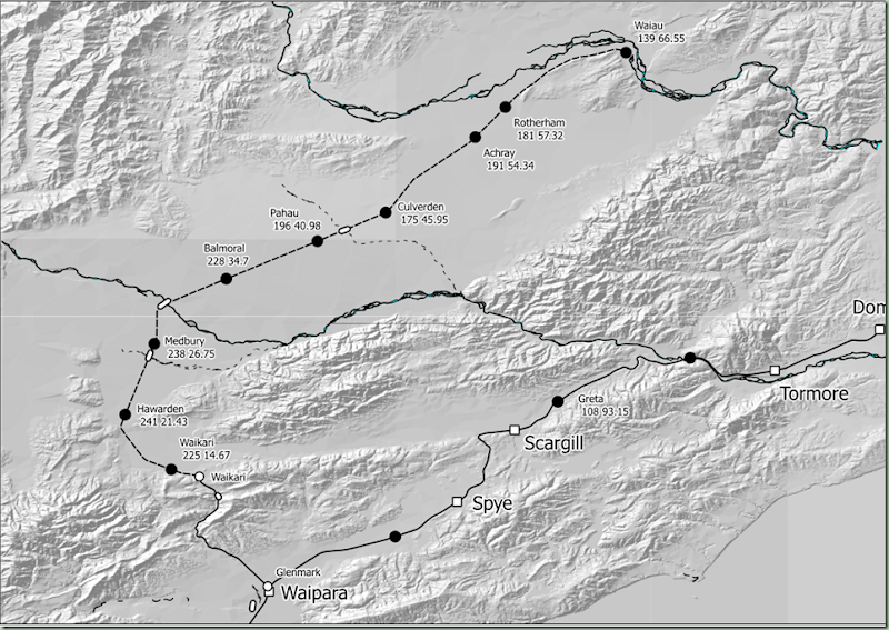
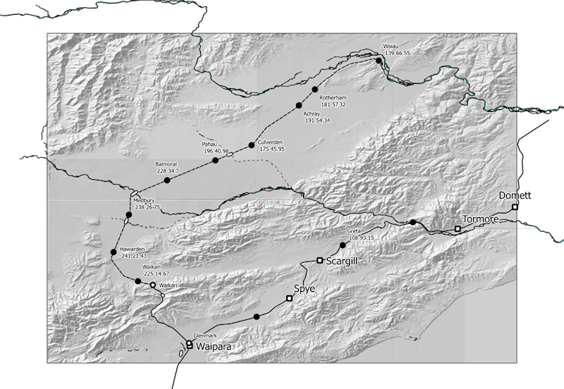
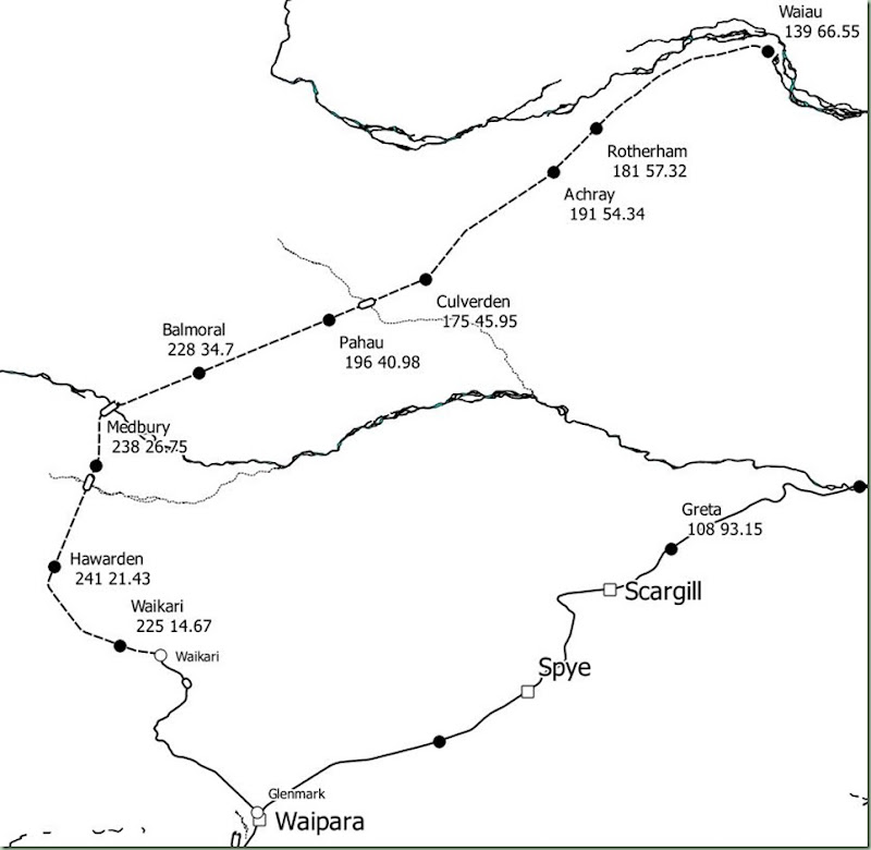
As I noted in the previous post the first step in turning our SVG into a workable map is to clean up the errors produced by the SVG export plugin in Qgis. This image shows how I have removed the paths that were spilled outside the print composer rectangle so that it now looks exactly as it did in the print composer. The next three things to be done are to:

  • Fix the changes in open circle and open square symbols, where the export has resulted in a thicker border than was used in Qgis
  • Move some of the Qgis generated captions to more convenient locations (where they are in the way of other objects); and
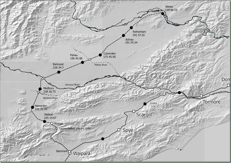
  • Add a few more captions where they are useful. In this case we are going to add captions for the four bridges (the Weka Pass viaduct and the Waitohi River, Hurunui River and Pahau River) and also the Waiau River which is prominent at the top of the picture although the Waiau Branch did not cross it. 

waiau4b

Here is the next iteration of the map with the existing captions moved into better positions and the symbol line thicknesses adjusted to be consistent. One point of note from using Qgis to label the stations is the buffer which is put around each label (when this feature is turned on), basically this is a white border around the text. This turns out to be an extra object which has to be selected and moved along with the text. The buffer is actually only useful when you are drawing text that goes over the top of other objects, and since we can move the labels so that they aren’t over the top of other objects, we can turn off the buffer setting so there is less work involved in moving the captions. Another issue with the text generated by the SVG export from Qgis is that it is not exported as an SVG text object, but as a group of paths (each letter would be a separate path). This means it can’t be edited using the text editing tools in Inkscape. In other words, these auto generated labels are only useful as long as they are correct. You can move these labels around like objects, but you can’t edit them as text objects in the SVG. To be realistic, they should not need to be edited; it is really a question of whether the fact they are exported as paths rather than text objects has any impact on the print or display quality.

waiau4c

Above is the final rendering of the map for this post. The station name labels on the Waiau Branch have been realigned (the second line was indented compared to the first line in general) and the buffers around them removed. I forgot to label the Waiau River when I put in the labels for the four bridges which appear above in italics. The map was able to be printed out from Inkscape and it looks very good on paper, being of a high quality; far far better than any of the bitmaps I dumped out previously would have been. I remember looking at Inkscape earlier in the piece when I was first looking at systems I could use to computer draw the maps. That was before I decided to use a GIS (which of course is Qgis). The context at the time was that a KML to SVG convertor was available and it was proposed to convert all the KMLs I have from Google Earth into SVGs that could be used to generate simple maps (like Q4 maps generally are). This was one of the many options I investigated for being able to generate maps electronically (on the computer) to replace Q4’s hand drawn maps. In the event, the fact I have been able to use Qgis for the map generation is light years ahead of Google Earth – for one thing Qgis is far more stable. Over the years the amount of work I have lost owing to the frequent crashes of GE has been very substantial and enough to make you really wary of doing something this big in it.

The next posting in this series will look at map rotation which is supported in QGis print composer but it doesn’t automatically straighten the labels. It should be possible for Inkscape to rotate the labels back to horizontal in such eventuality. Being able to rotate the maps is useful for some of the depictions in certain pages of Q4 where it is generally being used to maximise the efficiency of using the map canvas, by displaying multiple map sections on one page.

Quail replacement option [2]

Since I last wrote about this two days ago, the option of producing maps via SVGs has come into consideration, by way of discovering the print composer feature in Qgis. This would be a great way of working around some of the issues in producing maps similar to Q4 from Qgis. For example, as we noted, one of the issues so far is to be able to put captions onto every feature that we want to label. Let’s say I choose to label my map with just the stations captions which are auto generated from the attributes table columns in the layer shapefile. I have put in the terrain relief shading as well. I then opened my print composer, put in the map, scaled and panned it to the part that I wanted to see, and then exported it to SVG. To get something that can be posted in this blog, I opened the SVG in Inkscape and then saved it to the PNG shown below.

waiau4

As you can see, there are some edges to be cleaned up. This is due to a limitation of the Qgis SVG export plugin. That would be part of the image to be fixed up in Inkscape. After that, the next step would be to add the text captions you need. Those next steps will be what I will be investigating tomorrow. Since I haven’t used Inkscape before, the next thing I will need to do is find some online tutorials. The above map depiction, of course, is greyscale and it is quite an addition to the current Q4 mapping and probably the most significant enhancement. It depends, of course, on whether it is cost effective to produce the maps in greyscale, rather than all black as they have been printed in the past. I am pretty pleased with what you can see in the above picture, but it needs more captions to be added and these will have to be done in Inkscape which handles SVG as a native format.

Therefore the production of maps electronically for a printed replacement for Q4 (e.g. Q5) would require, first of all, generating an output from Qgis for each page as an SVG, and then editing that SVG in Inkscape to add captions or other text for any additional preparation needed for that page. From there the graphics are put into a source document which is used to produce a publication. One important difference is that Qgis lacks the ability to rotate the maps from a north-up perspective which is the default setting. In the Print Composer you can rotate the display of the map but captions don’t remain in the same orientation as before, which is an issue. It may or may not be possible to fix this in Inkscape, but I’m not going to make any assumptions on that, since I don’t know much about how Inkscape works just yet.

QGIS Print Composer experimentation

So far all the maps that I have produced with QGIS have been screen dumps saved as bitmaps, which is directly supported from within the application (Google Earth has a similar feature). These are then pasted into Word documents, whereby other content is added to the document and it is then saved as both Word and PDF formats. Today I discovered how maps can be exported into other formats directly from QGIS. The software has a feature called a Print Composer that is specifically designed for outputting a complete map based on the current view of the QGIS main window. It can then export that map into several formats, including SVG and PDF. SVG in particular has the advantage of being a vector format. Maps exported into this format can be printed at any size and will scale cleanly without jaggies, which is a severe limitation of bitmap formats. It is therefore possible to create the highest quality output maps using these formats compared to what can be achieved with bitmaps, already I am noticing some issues with how the bitmaps are rendering when printed out so that is why I am keen to see what can be achieved  When I zoom in in Word to the bitmaps then the issues like jaggy rendering are pretty obvious and this limits their usefulness, whereas with other formats print quality can be made higher. This is also a consideration for other types of output, for example if printed out as Q4 is.

The next challenge is how to use the SVG or PDF for different things? Word doesn’t directly support SVG (even IE9 didn’t directly support it until v9 was recently released) so there is going to be a problem trying to put SVGs into Word documents. I would have to look at perhaps editing in another editor (perhaps in OpenOffice) and saving to format such as PDF. I looked at Acrobat as the official Adobe PDF editing solution, but it is very expensive to purchase except in the educational edition. OpenOffice supports SVG from recent editions (as it is now produced by Apache). Another option is to save to PDF in QGIS and then use Word 2013’s capability to import the PDF into a Word document. It would be interesting to know what format it converts graphics into by this process. The graphics I am seeing in a Word document that was imported using this system are very sharp compared to the bitmaps I have been putting together so far. The part that won’t scale well is the terrain relief background, which is a raster format, but that isn’t so important, and in fact with the contour lines, you can theoretically dispense with it altogether, because those lines show all the detail you need to know about landscapes.

So I will have to have more of a play with these features to see how useful they will be for the future. One limitation of Print Composer is that at this stage it doesn’t support multi pages. Each page would have to be separately exported to its own PDF and then it would have to be opened in Word and the graphic copied to the current Word document. On the other hand in Print Composer you can easily rezoom or pan the map view so you don’t have to go back into QGIS and change the view to see something different in the composer. So when it comes to outputting your maps they can easily be all done from the Composer as the map object is in effect its own view (according to the currently displayed layers etc).

Wednesday 26 December 2012

Quail replacement option [1]

In the last few posts I have looked at whether it becomes feasible to replace the current maps of the NZ Railway and Tramway Atlas (which are based on hand drawn originals) with electronically sourced maps, in other words maps that have been generated using a GIS, such as the maps I am currently drawing on QGIS.

The answer is that theoretically it could be possible to produce something similar, depending on how much detail is needed. One of the key features of the current NZRTA is the number of tramways that are drawn into it. Of necessity, to be able to put these into QGIS, a source document like a NZMS1 or NZMS2 topographic map, or something of similar scale, is required that shows the route clearly, because enough data is needed in order to be able to accurately reference the route in relation to other known geographic features. It simply wouldn’t be realistic to be able to copy the currently depicted tramways from NZRTA4 (Q4 as I usually call it) into QGIS because there is nowhere near enough information in Q4 to show the route of a tramway in relation to other features. The Q4 maps are quite small scale. In their context this does not matter, but obviously I want to have something that can be used at a range of scales, so the locations have to be able to be made reasonably accurate.

So essentially the type of data that would be likely to make it into maps produced at Q4 scale is that which appears on NZMS1, NZMS2, NZMS260 or Topo50 maps, or other maps of similar scale. This is going to let out a lot of tramways. That also raises the question of how those routes were originally mapped in Q4 or earlier editions. There may well have been other maps they were sourced from. Or they in some cases may simply have been drawn approximately. The simple answer to that question is that probably only a percentage of the currently depicted tramways would be likely to appear in any case. My view is you can cover for this by including Q4 as an appendix to a new edition, either in printed or electronic form.

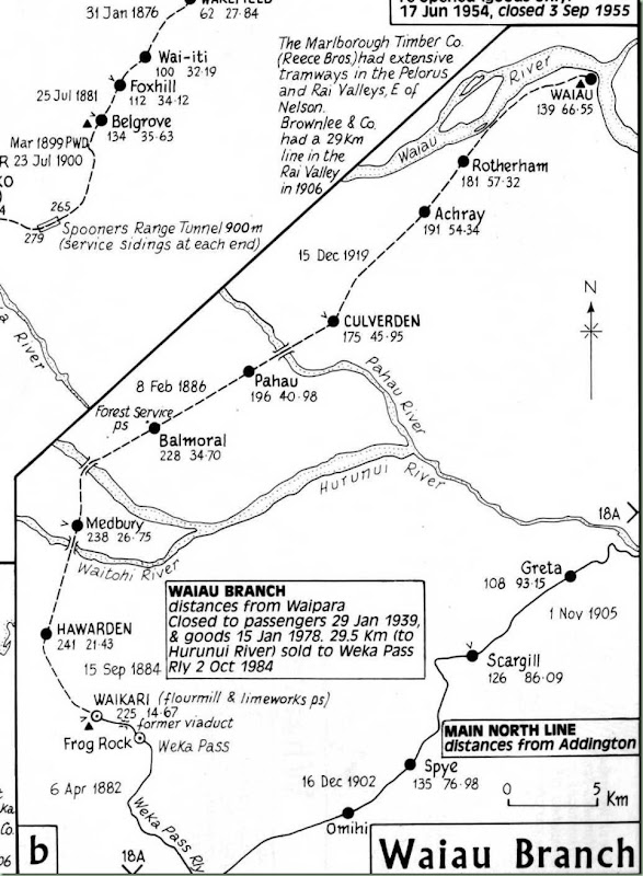
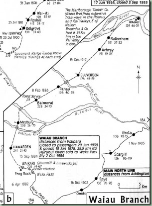
Here is the part page I reproduced earlier from Q4 showing the Waiau Branch. This time I’ll make it a bit bigger.

waiau2

By my reckoning the effort below is about as close as I can get using an automated printout from QGIS.

waiau3

So there are some obvious differences still. The automated display of the station captions is made possible by adding a couple of extra columns to the former station names table – altitude and distance – and then using another powerful QGIS feature called expression-based labelling. In essence, the label that is displayed can be made up of, for example, several fields contents joined together, in this case formatted to appear on two lines (the way that Q4 displays the captions). The rivers got copied in from the river layers from LDS into a custom layer simply because there are far too many rivers and streams in the real world – to reduce clutter I have kept to only those rivers which are crossed by major bridges (the three between Hawarden and Culverden – and also the viaduct in the Weka Pass).

I think this is about as much data as can be usefully displayed automatically from QGIS. Labels for the rest of the data, if you wanted the same sort of level of information displayed as on Q4, would have to be put in by hand, whether using any QGIS feature, or some other package (for example if a screen dump has been saved into a JPEG and is then edited in a graphics editor). One area is in tunnels, that is an issue at the moment because you want to be able to display every tunnel, yet if they are too close together their captions might clash with each other so that some of them would be missed out.

This is about as far as I am prepared to go in looking at a Q4 replacement at this stage – the rest will depend basically on whether the NZ railfan community at large is interested in an electronically sourced replacement of Q4, and that is hard to determine at this time. Are you stuck with the historical format of Q4 and its predecessors or can you look at new ways of displaying the data? And while I don’t wish to labour this point – the map I have drawn has addressed some mistakes in Q4. Compare these to see some of them.

Sunday 23 December 2012

Railmaps for different uses [2]

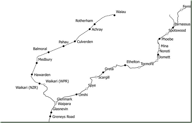
Here are 2 pictures to illustrate what was discussed last time.

waiau1 waiau2
A small scale QGIS map The equivalent page of the NZ Railway and Tramway Atlas 4th Edition.

At a quick comparison there appear to be some geographical differences (apart from detail) between the QGIS sourced map and the Quail sourced map. Which leads me to believe that a map sourced from QGIS is going to be inherently more accurate. One of the more obvious examples is the placement of Greta station. On the Quail page at right, Greta is listed at 5 km north of Scargill, yet the distance appears to be similar from Scargill as the distance to Spye, which is 10 km south. There are also some less major differences obvious in the maps of the Waiau Branch.

Monday 17 December 2012

Railmaps for different uses

This is a good time to be thinking about the different uses (or markets) which exist for maps in a printed format, which is the format that the majority of users are likely to relate to. Electronic format can be handled with GPS which is a different strand of interest and is not presently a high priority. QGIS includes GPS features and I will look at these at some stage, as well as the possibility of exporting some data into Google Earth KML files. However the most important priority as of now is the printed formats and I won’t be considering anything in another format until there is a Level 0 map produced for every NZR line in New Zealand.

Smaller scale maps for people such as long distance passenger or excursion travellers who are less interested in the detail, is an important consideration. A way of achieving this is to produce the main map (such as MNL) in an overall smaller scale. The 75 page map is suitable for those who want to find specific locations en route, however for open lines there is considerably less interest than for closed branches where the extra level of detail from the large scale is useful because it is much more difficult to find aspects of the line. A smaller scale map would be likely to omit some of the extra data such as street names and contours that are present in the large detail maps as they are drawn. Because it is much more difficult to control the display of data from other maps (for example, all of the stations in each region are presently in the same map layer), at this point I will have to move to dispensing with global layers except for LINZ layer data that is impractical to localise, and placing all the features and paths that are not directly sourced from LINZ into regional layer files. Probably even into line specific files. Therefore the template files will be updated so that there are sectional templates for these.

So that is where the work will also go in the next week in the two currently in existence regional projects (Canterbury-Westland and Nelson-Marlborough) in reorganising their layers. I am also considering another proposal which is to organise all of the projects on a sectional basis. That is that there will be a specific project for each of the major lines (the folders that are in the root folder of the project as they can be seen on SkyDrive). The regional organisation to date for the projects has been naturally organised this way as it is based around the organisation of the LINZ data layers. However, provided that all of the LINZ data layers are organised in a logical and easy to find way, there is no reason that this constraint should apply to the organisation of the projects and the custom layers. There is no issue with data duplication as the LINZ data layers will be placed into a common repository folder structure that can be accessed by all of the projects. Within each project there will be separate layer groups for the branches and heritage lines which are associated with each of the major line routes. This will enable full control of the displayed data for different lines depending on what sort of printed format is desired.

These questions are the reasons why the NZ Rail Maps project has proceeded slowly to date and why I have ignored requests to produce maps for other regions. There is quite a lot of work in these reorganisations. At a practical level, all of the datasources in each project contain a hard coded file path, and these have to be updated manually when the datasources get moved around on the computer. For example, today I reorganised the Skydrive folder structure to place a folder for each line at the root of the project, which contains the output map files, and a Sources folder in the route, which contains the redistributable layers. This level of reorganisation means 252 path references in the project .qgs file have to be updated with the changed locations (because the project file itself is saved in a slightly different location as well). As the project file is stored in XML format it is simply a matter of opening that in Notepad++ and doing a global find and replace (after making a backup copy of the project file, of course!). Since I also have to change the paths for the fixed layers I may as well create a proper repository structure for these that is easy to follow. This means yet more work. However once these decisions are made and implemented they will be followed for the remaining regions and the extra work isn’t needed. You can see that by piloting these changes over only the two current regions I have saved myself a lot of work later on in changes to other regions if I had pushed ahead and created all of these already.

Saturday 8 December 2012

NZ Rail Maps Development Strategy

When I first put together the NZ Rail Maps website (the old one) I had a development strategy for the project. For this second edition there will also be a strategy.
Maps will be developed at three levels. Each level will be reflected in the major version number of the map (the part before the decimal point).
  • Level 0 is what is currently being developed. Essentially this is just drawing in the basics of routes and stations from the source maps. The Canterbury-Westland project will be more unique in that a lot of additional work has been done; however, as of today, maps will be developed at the Level 0 criteria.
  • Level 1 is a more indepth treatment in which additional detail is being filled in. Likely this will include additional stations and bridges which are not found in the original maps.
  • Level 2 aims for completion and is likely to include bush tramways and other lines that are not part of the national railway network.
In addition a comprehensive key is still being developed. The two sets of images below represent the current edition (0.7) of the key.


The symbols are used at fixed locations on maps to illustrate features that are or were found at these locations. The set shown above is reasonably comprehensive and has not changed markedly in the last few editions of the key. However I opened the XML file today and renamed all the symbols so the names are meaningful and follow a standard format. Below is the symbols as they were at 17th November so you can see quite a few changes. One symbol has been removed and that is “points”. I experimented with showing where a set of points was located on a track diagram but have decided to remove the unnecessary extra detail. “Rail Placename Holder” has been given the more meaningful name of “Uncertain Station”. This is always a closed station by definition, just as “Current Service” is always an open station by definition, and thus these two use complementary symbols but unlike most of the others are not a current/former pair.


Now let’s have a look at paths, which is the other main type of style used in the maps.


Once again, an earlier style set is below.


Paths is the area where the key has most changed in recent editions. As you can see, path names have been standardised with “open” replaced by “current” and “closed” replaced by “former”. Bridges and tunnels now have three styles corresponding to the three global layers used. In both cases, Current is used exclusively for rail bridges or tunnels, while Former can refer to both rail and non-rail bridges or tunnels. Other is used to refer to current non-rail bridges or tunnels and it includes road types, as well as bridges or tunnels on former rail routes where the structure is possibly or definitely not the original rail structure. Note there used to be a “reconstructed bridge” style which has been rolled into “Other Bridge” to simplify things.

Originally the path style “Uncertain Formation” was not planned to be in the maps but it covers two scenarios that I have used before. The first of these is using the standardised caption “Inexact Route” because I have discovered that I do not have a source map for part of the Roxburgh Branch route and this may also be the case for a small number of other lines. The same path will be used for hypothetical formations, with the standardised caption “Hypothetical Formation”. Both will appear on the main maps but will be clearly marked using either of those captions as appropriate.

Some of the more recent other changes in paths include: aerial ropeways, closed sidings, closed tramways, and present and former rail corridors. In all cases I have attempted to create paths that are clearly distinguishable from each other. There are certain stylistic similarities related to the status of each type of path and I have attempted to produce a consistency in these, but this is not always possible owing to obvious challenges. The biggest improvement over Google Earth is in being able to use the different path styles. In GE I could use colours instead of styles. However, in order to be printable, these maps have to be clearly rendered in grayscale in which colours are of no account. The path shown for a river has been changed from the above so that it is more easily distinguishable from a road. Everything has to be able to be printed on a monochrome printer because colour printing is still far too expensive. The contour line path  has also been changed recently to be less obtrusive and also easier to distinguish from the river and former road paths.

Whenever a key is updated, it is going to be some time before the new key is included in all previously published maps. At Level 0, the keys of existing published maps will not be revised unless the map graphics are being updated. In addition the maps themselves will not show the new symbols or paths where there has been a change, unless the map itself has been updated, at Level 0. This reflects that at level 0 the map designs are still being refined and may change quite often. Once I get all the level 0 maps published I expect to have finalised all the styles that are needed and be able to update all the maps with their Level 1 revisions.

Sunday 29 July 2012

Change in NZ Rail Maps Project

Well this has been on the cards for the last few months. At the beginning of this year as was publicised on this blog, the site was put into archive format, with the announcement there would be no new updates posted. This was as a result of a decision that I would like to produce content on the Open Street Maps platform instead.
Since that time while doing stuff on OSM, I quickly realised it would be limited to current rail lines only. So the decision was taken to continue the development of the current Google Earth based maps. As usual this would be done in conjunction with the wider NZ railfan community.
On 10th June, with the support of Steve Watts, who owns the copyright of the NZ Railway & Tramway Atlas 4th Edition and recently produced a reprint of this edition, I formed a new Yahoo group to continue the development of the maps. This has evolved into a research community and its scope has changed to look at replacement formats for the present NZRTA. It is infeasible to produce a printed map directly from Google Earth because of licensing restrictions with the satellite/aerial imagery, so the decision has been taken to produce new maps in Quantum GIS using the free Linz data layers.
At this stage the idea is to produce large format maps in A4 or A5 format. Each individual map page is A5 size at a scale of 1:10000 when it is generated on the computer screen, and two of them would fit onto an A4 page. The scale will permit a considerable amount of detail to be shown, including the names of adjacent roads, and significant features or remnants to be marked on the map.
I will now be creating these new maps alongside the maintenance of the existing maps, and they will be used on the Yahoo group and probably will result in a printed publication in the future. Only the existing GE maps will be freely distributed, and this will continue to be done through my existing website.
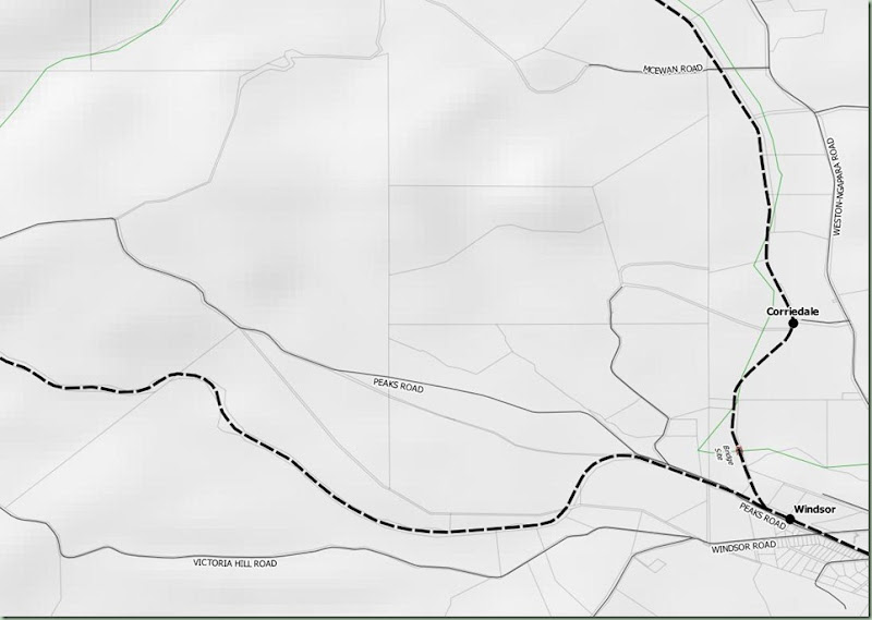
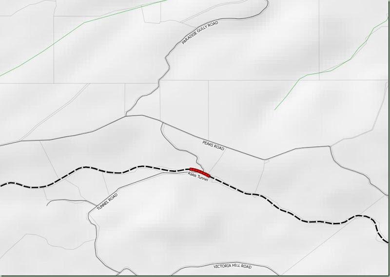
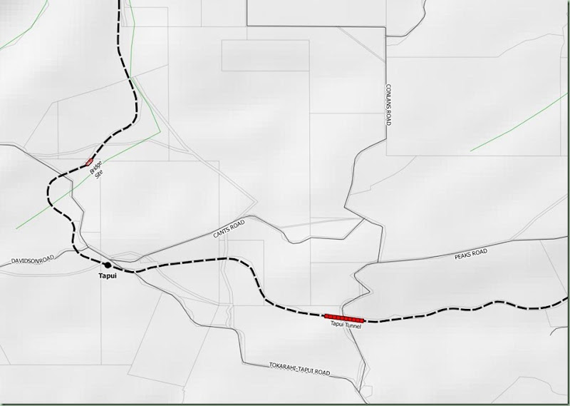
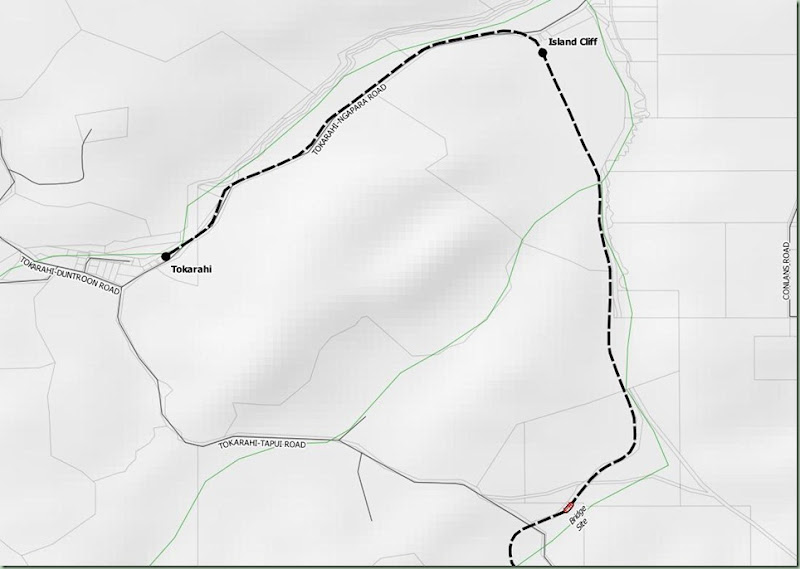
Here are some early samples showing the Tokarahi Branch inland from Oamaru. The roads come from the Linz data layers and the labels are part of that layer. The other Linz layers visible are rivers/streams, property boundaries and contour shading. This is about as much detail as can be usefully added to something that will be produced in a greyscale format.
NT05NT06NT07NT08