In the last few posts I have looked at whether it becomes feasible to replace the current maps of the NZ Railway and Tramway Atlas (which are based on hand drawn originals) with electronically sourced maps, in other words maps that have been generated using a GIS, such as the maps I am currently drawing on QGIS.
The answer is that theoretically it could be possible to produce something similar, depending on how much detail is needed. One of the key features of the current NZRTA is the number of tramways that are drawn into it. Of necessity, to be able to put these into QGIS, a source document like a NZMS1 or NZMS2 topographic map, or something of similar scale, is required that shows the route clearly, because enough data is needed in order to be able to accurately reference the route in relation to other known geographic features. It simply wouldn’t be realistic to be able to copy the currently depicted tramways from NZRTA4 (Q4 as I usually call it) into QGIS because there is nowhere near enough information in Q4 to show the route of a tramway in relation to other features. The Q4 maps are quite small scale. In their context this does not matter, but obviously I want to have something that can be used at a range of scales, so the locations have to be able to be made reasonably accurate.
So essentially the type of data that would be likely to make it into maps produced at Q4 scale is that which appears on NZMS1, NZMS2, NZMS260 or Topo50 maps, or other maps of similar scale. This is going to let out a lot of tramways. That also raises the question of how those routes were originally mapped in Q4 or earlier editions. There may well have been other maps they were sourced from. Or they in some cases may simply have been drawn approximately. The simple answer to that question is that probably only a percentage of the currently depicted tramways would be likely to appear in any case. My view is you can cover for this by including Q4 as an appendix to a new edition, either in printed or electronic form.
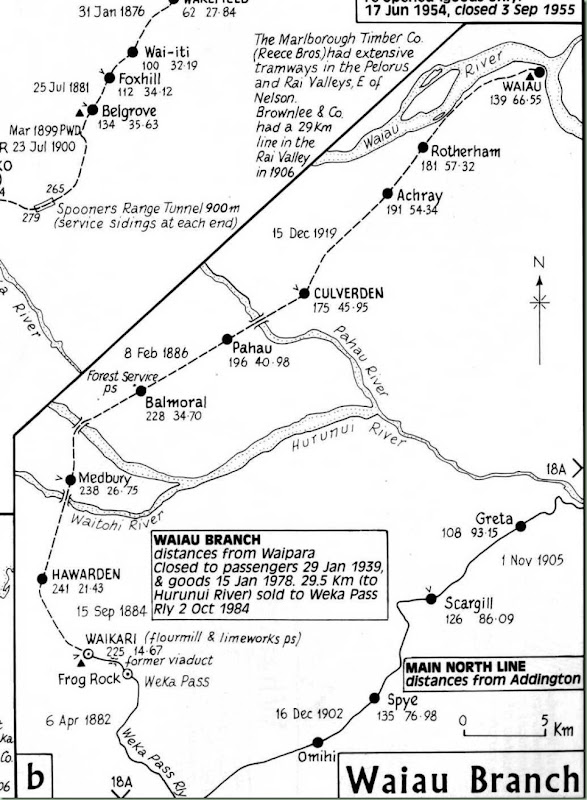
Here is the part page I reproduced earlier from Q4 showing the Waiau Branch. This time I’ll make it a bit bigger.
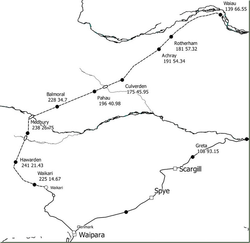
By my reckoning the effort below is about as close as I can get using an automated printout from QGIS.
So there are some obvious differences still. The automated display of the station captions is made possible by adding a couple of extra columns to the former station names table – altitude and distance – and then using another powerful QGIS feature called expression-based labelling. In essence, the label that is displayed can be made up of, for example, several fields contents joined together, in this case formatted to appear on two lines (the way that Q4 displays the captions). The rivers got copied in from the river layers from LDS into a custom layer simply because there are far too many rivers and streams in the real world – to reduce clutter I have kept to only those rivers which are crossed by major bridges (the three between Hawarden and Culverden – and also the viaduct in the Weka Pass).
I think this is about as much data as can be usefully displayed automatically from QGIS. Labels for the rest of the data, if you wanted the same sort of level of information displayed as on Q4, would have to be put in by hand, whether using any QGIS feature, or some other package (for example if a screen dump has been saved into a JPEG and is then edited in a graphics editor). One area is in tunnels, that is an issue at the moment because you want to be able to display every tunnel, yet if they are too close together their captions might clash with each other so that some of them would be missed out.
This is about as far as I am prepared to go in looking at a Q4 replacement at this stage – the rest will depend basically on whether the NZ railfan community at large is interested in an electronically sourced replacement of Q4, and that is hard to determine at this time. Are you stuck with the historical format of Q4 and its predecessors or can you look at new ways of displaying the data? And while I don’t wish to labour this point – the map I have drawn has addressed some mistakes in Q4. Compare these to see some of them.


